
Twitter / Transparency Center
YEAR
2019
AGENCY
MediaMonks Amsterdam
ROLE
UX Designer
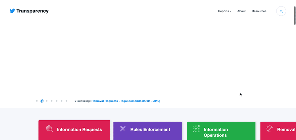
The Twitter Transparency Center is a dedicated platform that provides users with insights into Twitter's policies, practices, and operations regarding content moderation, user safety, and data privacy. It aims to foster trust and accountability by transparently sharing information about how the platform manages misinformation, handles reports of abuse, and enforces community guidelines.
From Content Structure to Wireframes
When I joined the Transparency project in September 2019, the groundwork had already been laid through comprehensive workshops that gathered vital business requirements, goals, challenges, and user needs. This strong foundation allowed me to seamlessly integrate into the project, focusing on refining both the Content Strategy and Information Architecture to enhance user experience.
Data Visualization: The Project’s Centerpiece
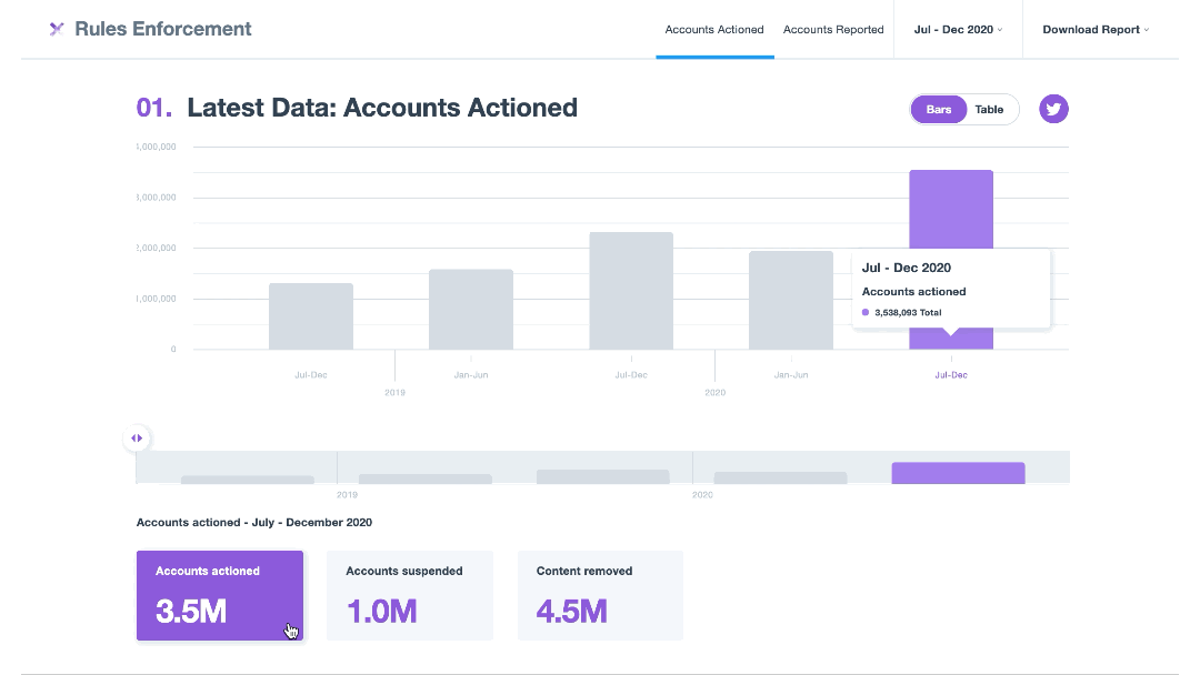
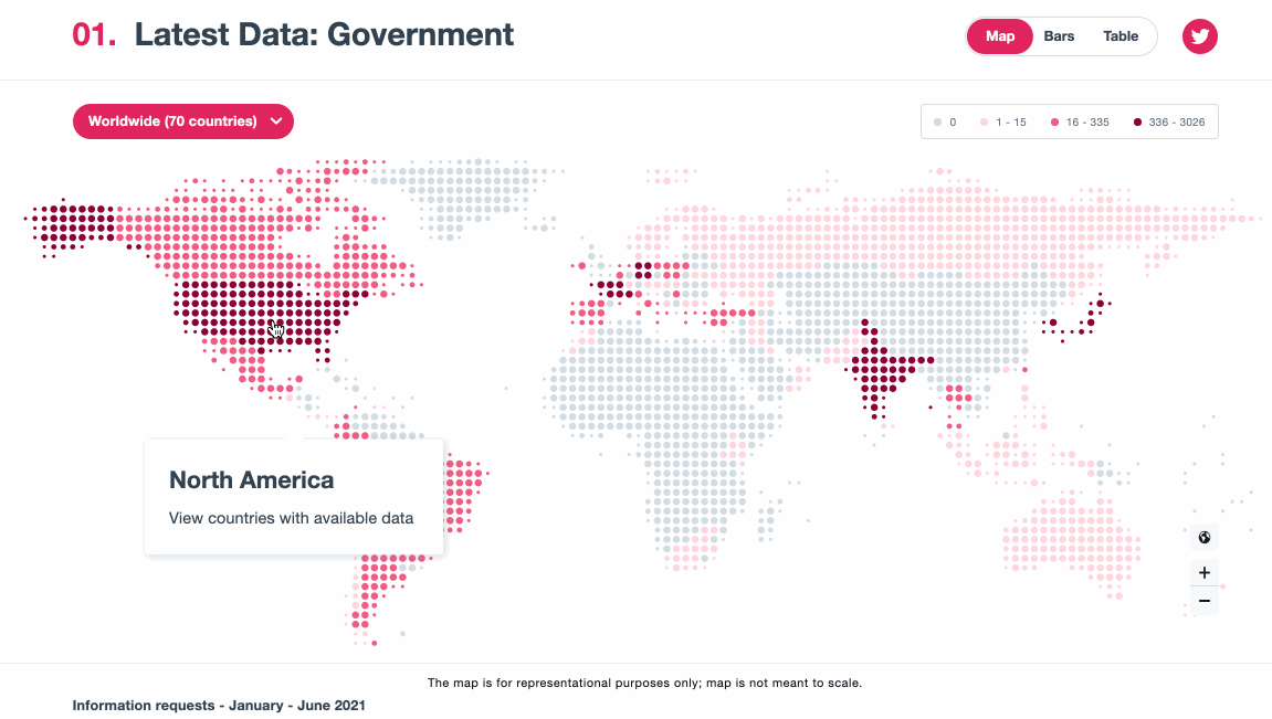
The most substantial challenge of the project was determining how to present and communicate complex data in a digestible manner. Our data visualization framework was built around four key principles: informative, interactive, pleasing, and exportable.
Throughout the website, users can explore a variety of data visualization formats, including maps, bar charts, pie charts, and tables. This flexibility allows users to choose how they prefer to engage with the data, ensuring a more personalized and intuitive experience.
Creating Engaging and Interactive Data Visualizations
I began by designing the simplest visualizations first—tables—relying on my intuition and familiarity with this format. Once I finalized the initial designs and received approval from stakeholders, I then translated the data into more complex visualizations. I followed this approach until all type of data visualization were created.
By combining strategic design with a user-centered approach, I helped create a platform that not only enhances data transparency but also fosters meaningful, informed interactions.