
Lab1 / Medisinsk Laboratorium
YEAR
2024
ROLE
Freelance Senior UX/UI Designer
Lab1 is a laboratory in Norway focused on providing users with accessible health and lab analysis services. The goal of this project was to redesign their platform to improve usability, make complex information easy to understand, and streamline key interactions like booking consultations and managing analyses.
Elevating Lab1’s Digital Experience
I led a comprehensive redesign for Lab1’s website, focused on improving usability, clarity, and user experience. Here’s what I accomplished:
Developed a new sitemap and proposed a restructured information architecture for better navigation and content discoverability.
Redesigned core pages: Homepage, Analysis Page, Analysis Detail Page and About Us. I've also created new pages from scratch: Appointments and Get Help.
Revamped the Appointments Flow to make booking consultations seamless. - Enhanced the Shopping Cart Experience, optimizing it for ease and clarity.
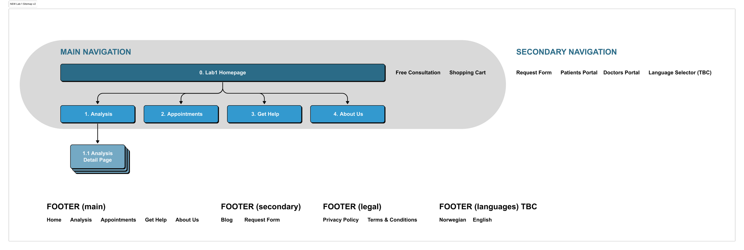
Phase 1: Sitemap and Information Architecture
A great user experience starts with clarity. To achieve this, I began by analyzing the existing sitemap and identifying pain points in navigation. I proposed a simplified structure to help users:
Find the right analysis effortlessly.
Understand Lab1's value proposition quickly.
Navigate services such as consultations and appointments with ease.
This resulted in a restructured sitemap and a new, intuitive information architecture.
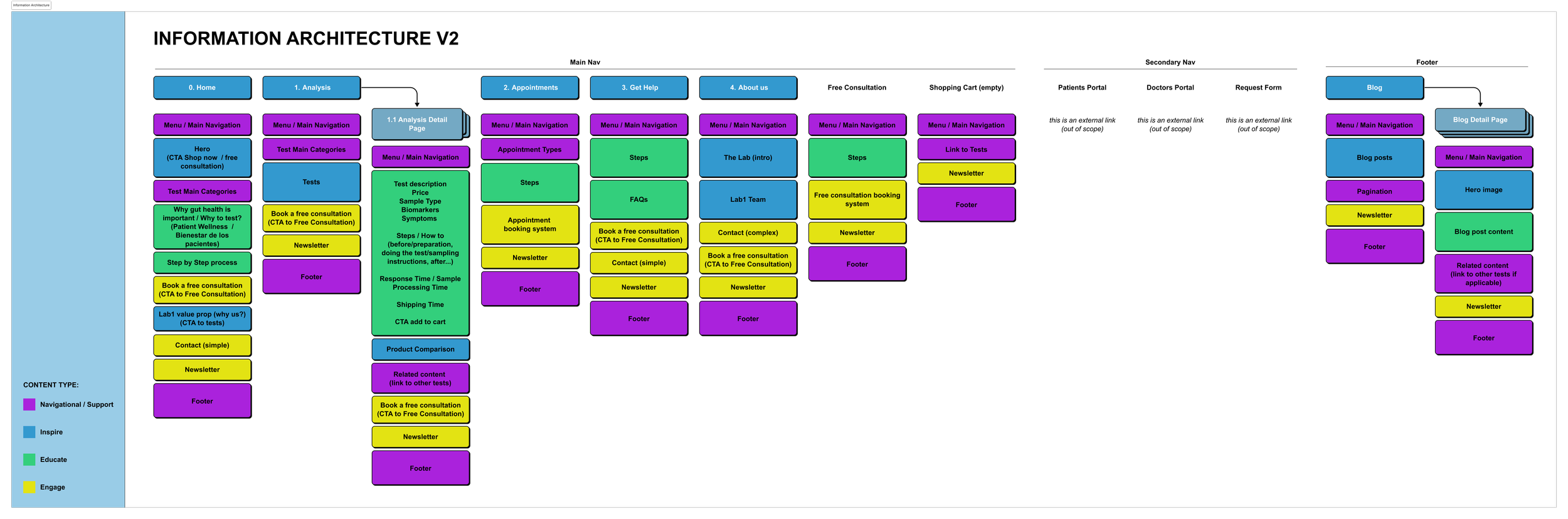
A critical part of the Lab1 redesign was redefining how information was presented and structured. I led the content strategy by auditing current content, aligning it with user goals, and ensuring that every piece of information served a purpose (inspire, educate, engage or navigate).
I then created a new information architecture that organized content logically, made navigation intuitive, and highlighted essential actions like booking appointments or a free consultation (which was very important for the laboratory in order to attract new patients).
Phase 2: Fonts and Visuals Exploration
To modernize the website, I explored fonts and visuals that could elevate the brand's identity while maintaining its professional tone. I aimed to balance clarity and warmth to resonate with both healthcare professionals and patients.
Typography: I explored clean, user-friendly fonts such as Poppins, Nunito, Quicksand that could combine with a serif like Libre Baskerville, ultimately choosing a combination that ensured readability and approachability.
Color Palette: I followed Lab1’s existing colors and incorporated softer tones for a more welcoming look.
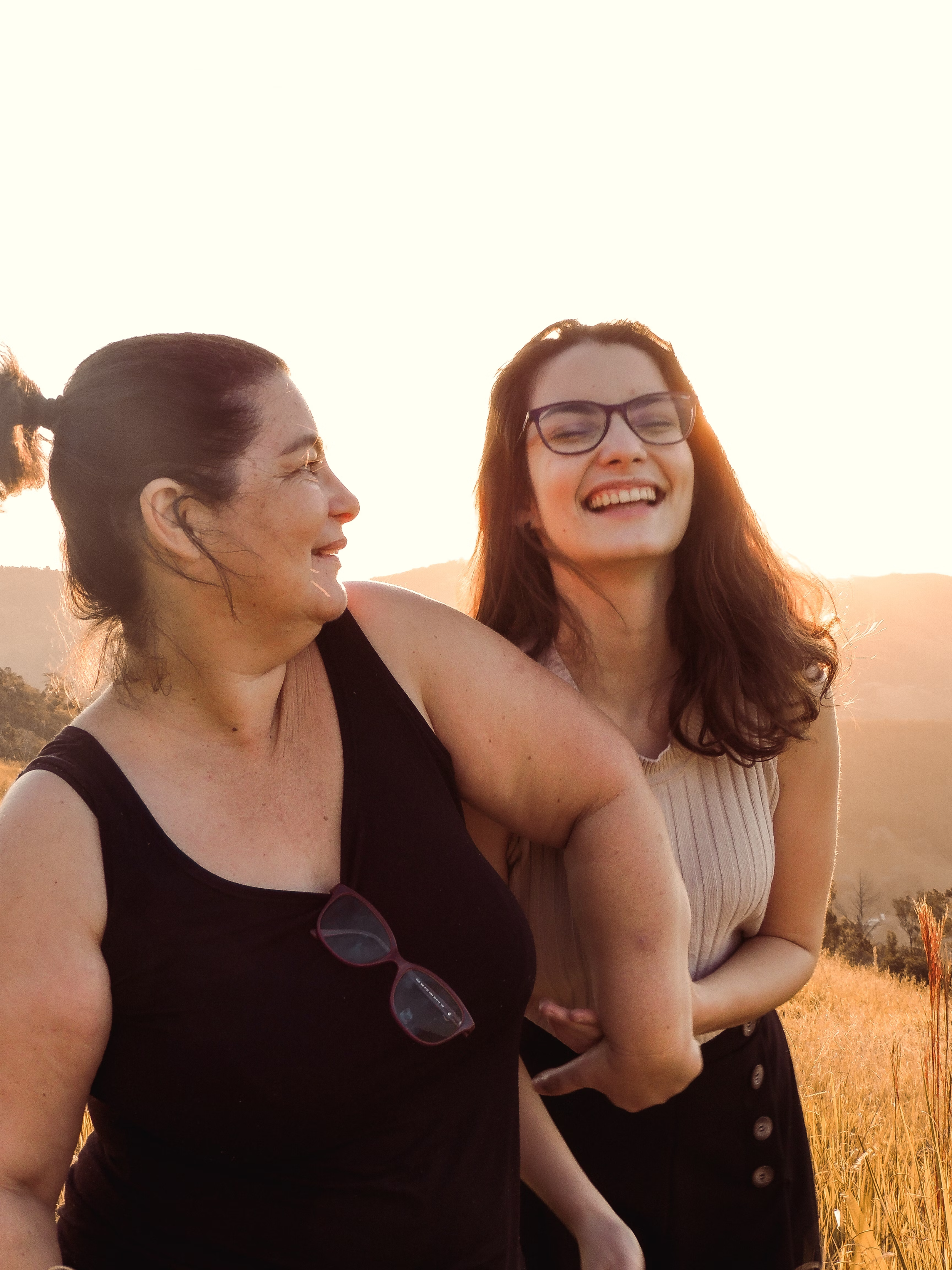
Imagery: The proposed image selection aims to convey a clear and authentic idea: real people, diverse in age, ethnicity, and body type, who enjoy life and their surroundings because they feel good both inside and out.
We wanted to move away from the typical “stock image” style that portrays unrealistic perfection. Instead, we chose to depict genuine, everyday moments that create emotional connection and a sense of closeness with our patients, reflecting a more human and approachable perspective.


Phase 3: UI Redesign and Component Creation
With the foundation set, I moved to the redesign phase, focusing on user needs and aligning the visuals with the updated architecture.
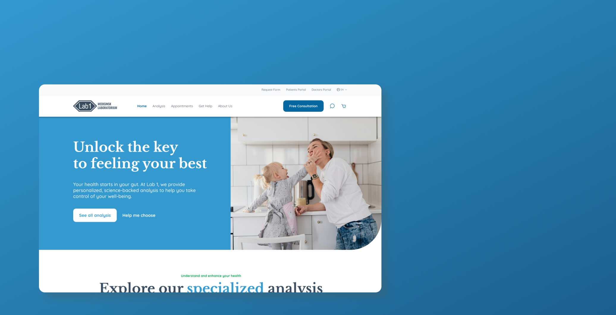
The homepage was reimagined to create a strong first impression. It introduces Lab1’s expertise and guides users to explore the analyses and book a free consultation.
A hero section, clear CTAs, and quick links to key pages ensure intuitive navigation.
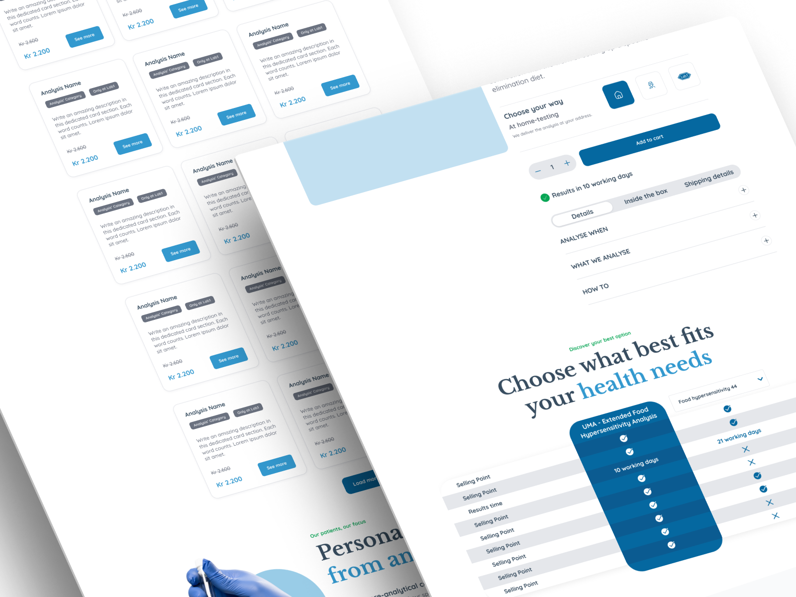
Analysis Category and Analysis Detail Page
I designed an engaging analysis overview page where users could easily find and filter analyses.
Also, an Analysis Detail Page that was structured to:
Simplify complex medical information.
Help users understand which tests are right for them.
Make the booking and shopping process straightforward.
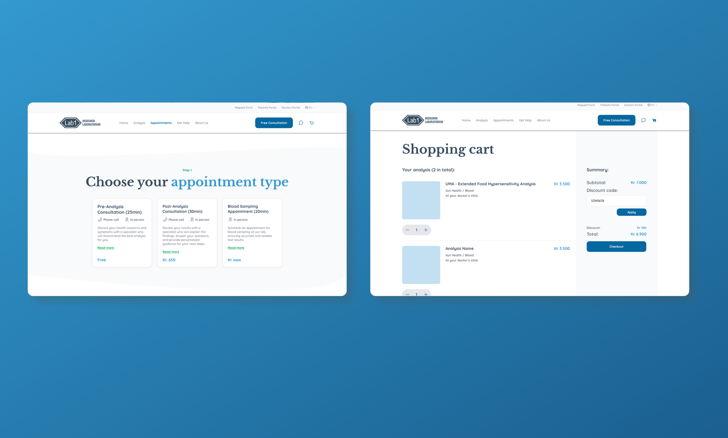
Appointments Page and Flow
The appointments page was revamped to highlight the different types of consultations Lab1 offers. I redesigned the appointment booking flow to be simple, with step-by-step guidance (selecting a specialist, date, and time and finally adding your personal details).
Shopping Cart Experience
The cart was redesigned to minimize friction during checkout, with clear summary details, easy forms, and user assistance.
Outcome & Takeaways
In just two weeks, I delivered a complete redesign of Lab1’s website, ensuring a cohesive and user-centric experience across all touchpoints. By rethinking the information architecture and enhancing the visual identity, I helped create a platform that empowers users to take control of their health with confidence.
This project challenged me to balance speed with quality. It reinforced the importance of:
Prioritizing user needs through well-thought-out architecture.
Iterating quickly on visuals to align with brand values.
Building reusable components to maintain consistency.