
Objego / Property Management Platform
YEAR
2025
ROLE
Freelance Senior UX Designer
Objego is a digital platform designed to help users manage their properties. With objego, users can track their rental income and expenses and easily create and manage their utility bills.
Context & Challenge
Objego provides a digitital tool for property management.
As the product evolved, parts of the experience became fragmented, creating usability challenges and inefficiencies. This impacted users’ ability to complete key tasks smoothly and limited the scalability of the product.
The goal was to improve the overall user experience by simplifying flows, improving clarity, creating a onboarding to reduce the drop-outs, and aligning the interface with user needs and business objectives.
My Role & Contributions
As the UX Product Designer, I was responsible for leading the UX improvements across key areas of the platform.
My responsibilities included:
Conducting a UX audit of the existing product
Identifying usability issues and improvement opportunities
Defining improved user flows
Defining an onboarding to reduce platform drop-offs
Designing wireframes and high-fidelity UI
Improving information architecture and visual hierarchy
Collaborating closely with other ux designers as well as product managers and developers
I worked with a high level of ownership, helping shape both the UX strategy and the final interface.
UX Audit
I conducted a comprehensive audit of the platform, reviewing key user journeys and identifying friction points, usability issues, and structural inconsistencies.
This helped prioritize improvements based on user impact and business value.
Through auditing and analysis, I identified several usability challenges:
Lack of clear visual hierarchy, making information harder to scan
Friction in key user flows, increasing cognitive load
Inconsistent interaction patterns across the platform
Opportunities to simplify workflows and improve efficiency
These issues impacted usability and made the experience less intuitive than it could be.
Key Insights
The audit revealed several opportunities:
Simplification of complex flows
Improved structure and hierarchy
Clearer calls-to-action and interaction patterns
More consistent and scalable design patterns
Next Steps
Based on these insights, I focused on:
Reducing friction in critical user flows
Improving clarity and usability
Creating consistent interaction patterns
Designing scalable solutions aligned with future product growth
I redesigned key parts of the platform to create a clearer, more intuitive experience.
The new design improved usability by:
Simplifying user flows and reducing unnecessary complexity
Improving visual hierarchy and readability
Making actions more predictable and easier to understand
Creating a more consistent and scalable UX foundation
I delivered wireframes and high-fidelity UI designs ready for development.
Designing Goal-Driven Onboarding & a Personalized Dashboard
As I said, objego enables property owners to manage their properties, track rental income and expenses, and create and manage utility bills.
However, new users had different goals when joining the platform. Some wanted to track finances, others wanted to manage bills, and others wanted a complete overview of their properties. The existing experience did not adapt to these different needs, which created friction and made the product feel less intuitive.
The key shift from: “Here’s how the platform works.”
To: “What are you here to achieve?”
This decision shaped the entire experience.
So, I decided it was time to define and design a goal-driven onboarding experience and a personalized dashboard that would adapt to each user’s priorities and help them get value from the platform faster.
My responsibilities included:
Defining onboarding flows based on user goals
Designing a flexible and scalable onboarding structure
Creating a personalized dashboard tailored to user needs
Designing wireframes and high-fidelity UI
Improving information hierarchy and clarity
Collaborating closely with product managers and developers
Problems
The existing experience presented several usability challenges:
The platform did not adapt to different user goals
New users were not guided based on their priorities
The dashboard was not personalized, reducing relevance
Users needed to manually navigate to key features instead of seeing relevant information upfront
This created unnecessary friction, especially for new users, and slowed down activation.
Next Steps
Based on these challenges, I focused on:
Understanding user goals
Designing the onboarding experience
Designing a personalized dashboard
I worked with the product team to identify the primary motivations users had when joining Objego, such as:
Tracking rental income and expenses
Managing utility bills
Getting a clear overview of their properties
These goals became the foundation for the onboarding experience.
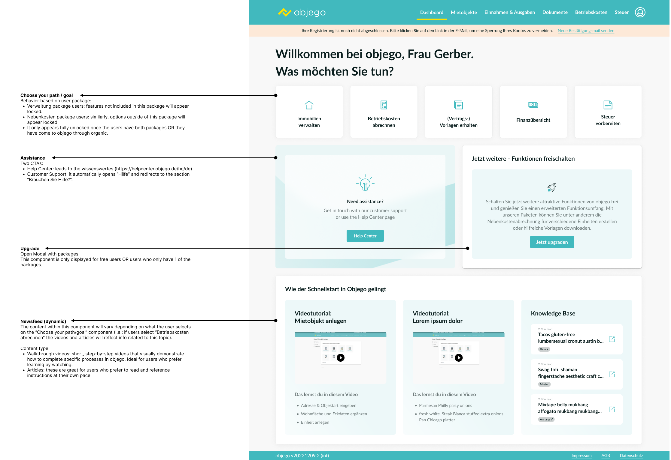
I designed a goal-driven onboarding flow that allowed users to select their primary objective when joining the platform.
Based on their selection, the platform could adapt the experience and prioritize the most relevant features.
This approach helped:
Reduce cognitive load
Guide users more effectively
Create a more relevant and personalized experience
The existing dashboard was static and feature-heavy. I redesigned the dashboard to reflect the user's goals and priorities.
The new dashboard:
Surface the most relevant information first
Prioritize actions aligned with user goals
Improve hierarchy and scanability
Reduce visual noise
Create modular, scalable components
The new dashboard structure was flexible enough to evolve as the product grows.
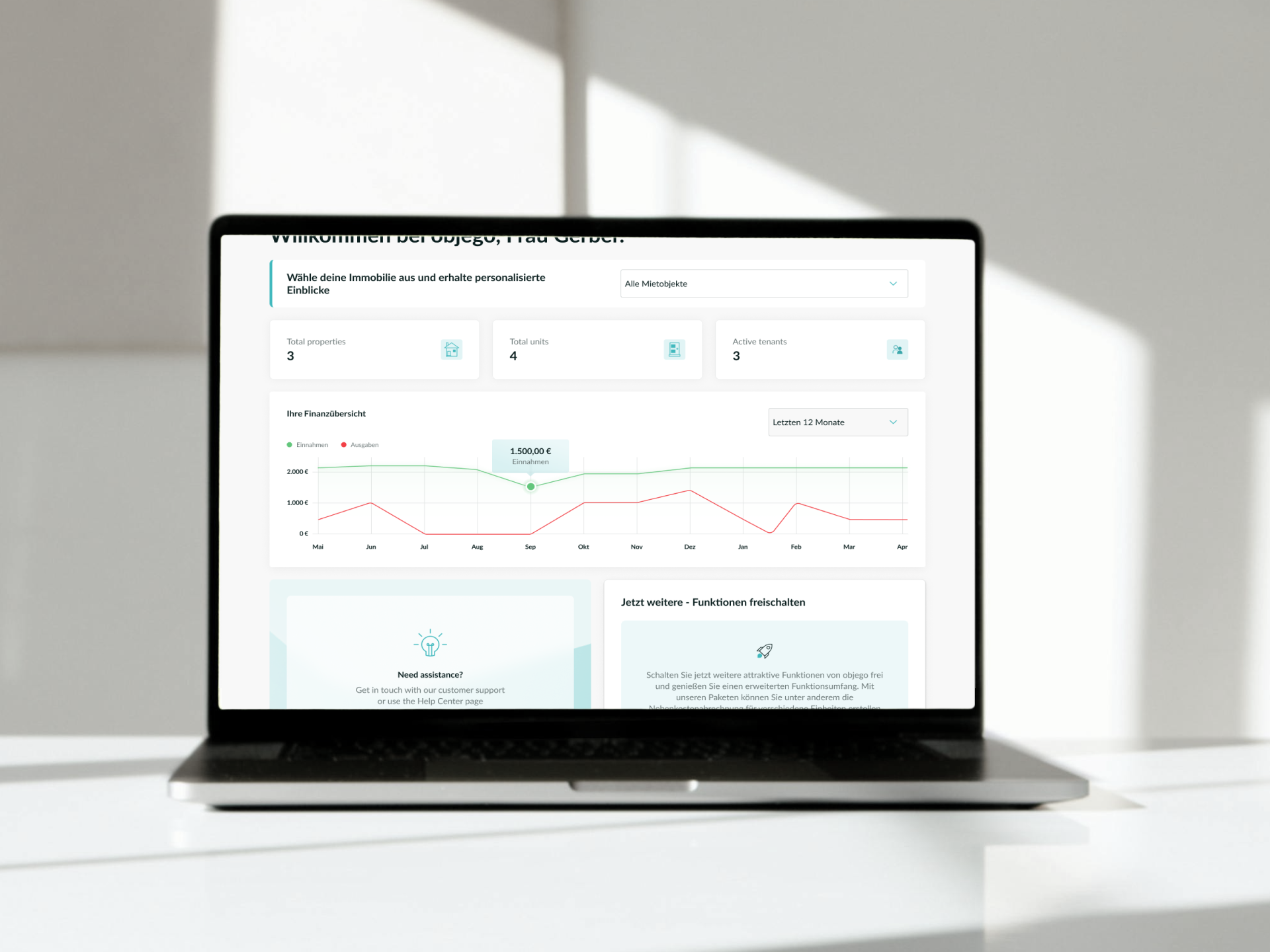
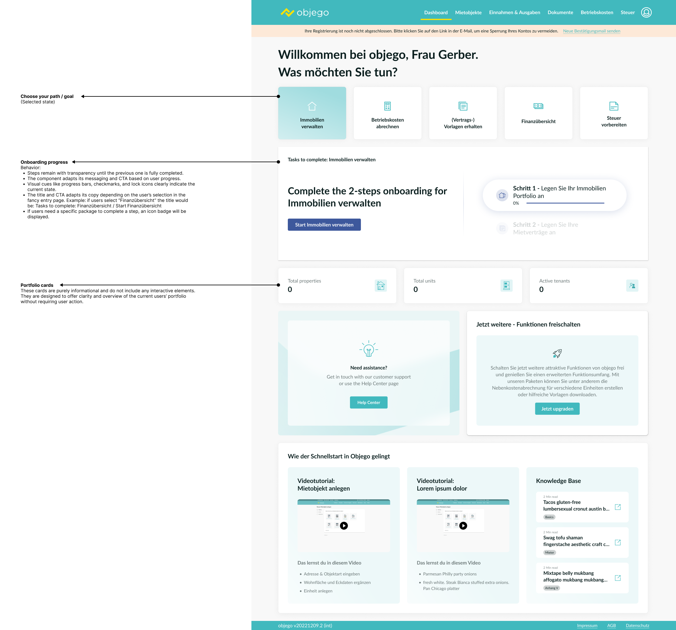
Analysis of the current dashboard
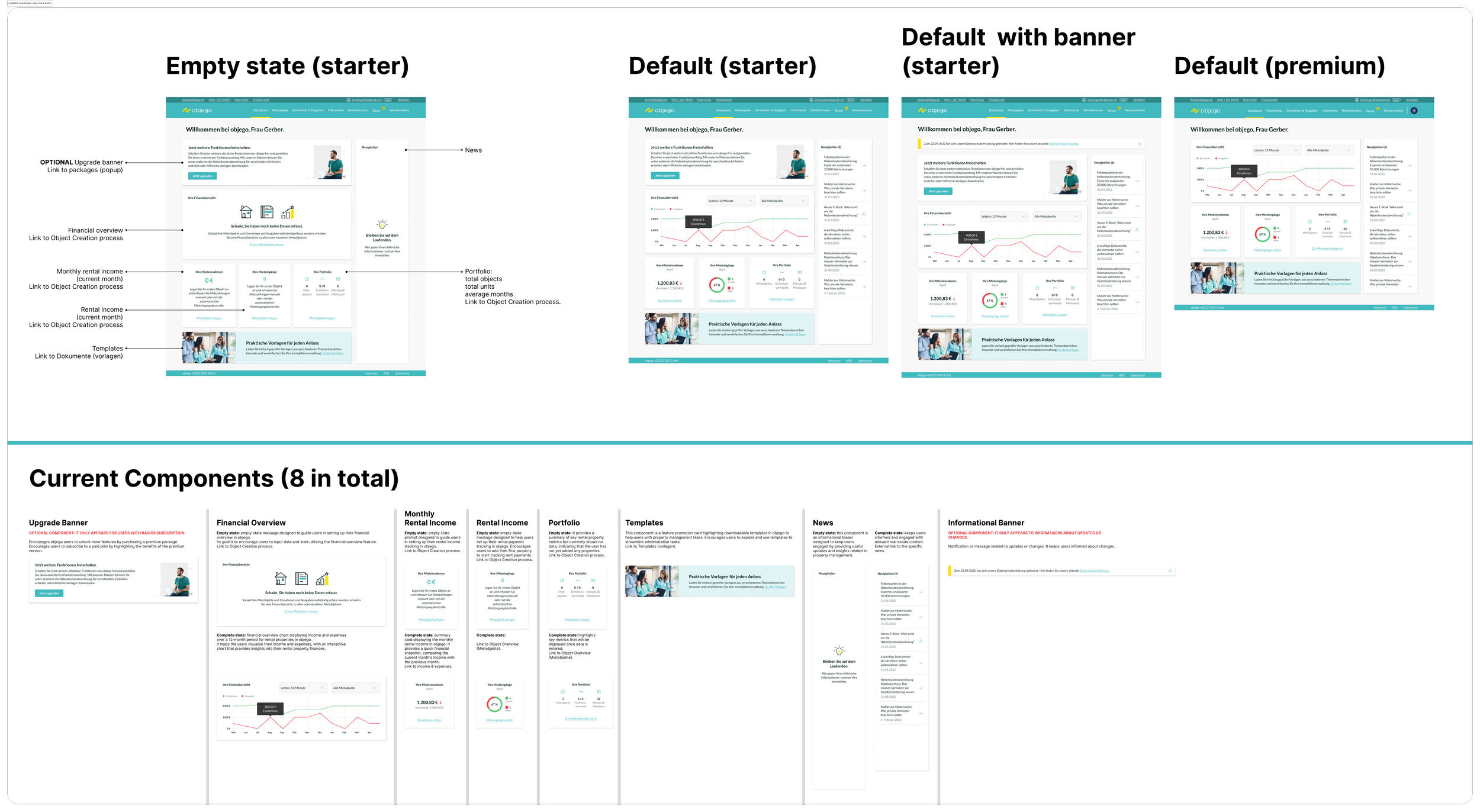
This is the default view for free new users the first time they join objego through the website. They decided to skip onboarding so no info has been inserted yet.
If users click on “Immobilien verwalten”. The dashboard adapts its content.
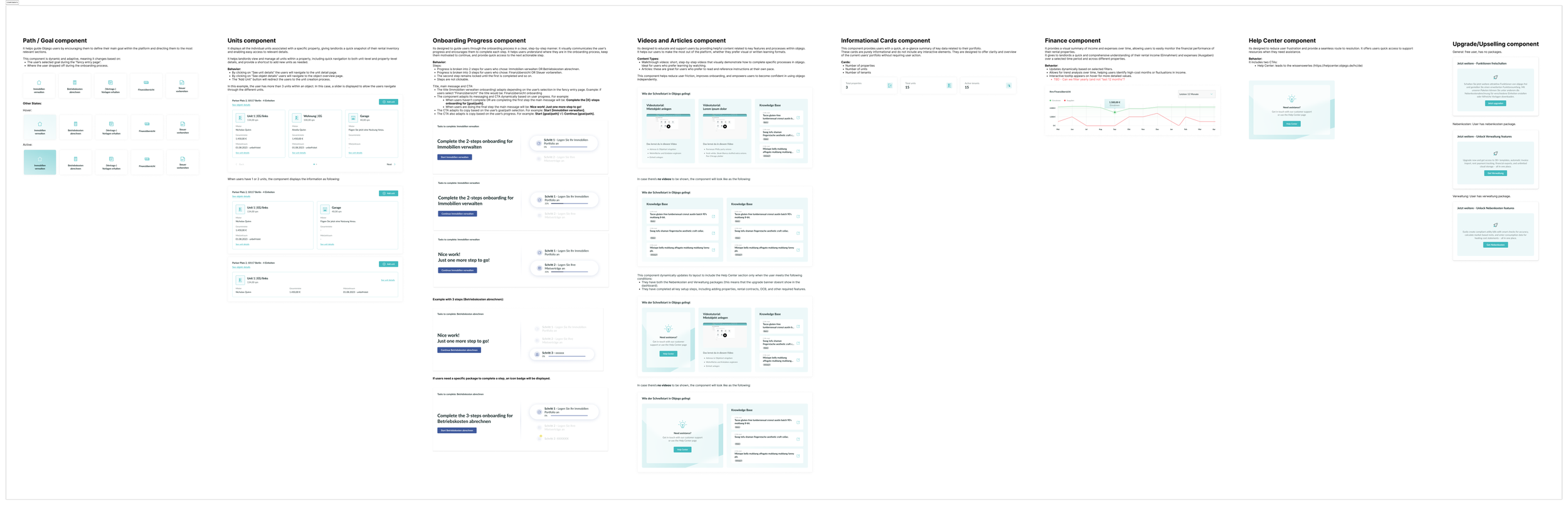
Building a Scalable Component System
Beyond designing individual screens, I defined the underlying component structure to ensure consistency and scalability across the product.
This included defining:
Component anatomy (structure and hierarchy)
Component states (empty, default, hover, active, loading, error)
Interactive behaviors and transitions
Usage guidelines and logic
Rules for responsiveness and content flexibility
Each component was designed as a modular building block that could adapt to different user contexts and dashboard configurations.
Solution & Impact
The redesigned experience:
Helped users get value faster
Reduced friction in early interactions
Increased clarity and relevance
Created a scalable foundation for future product evolution
Was positively received by product and development teams
More importantly, the product now adapts to users instead of forcing users to adapt to the product.
This project reinforced the importance of personalization and guiding users based on their goals, especially during onboarding.
By aligning the experience with user intent, I helped create a more intuitive and effective product experience while supporting long-term scalability.